This article is part two of two in my SQL Churn Analysis Series. If you have not read part one, We Lost Customers, But Not Revenue (Three churn definitions in SQL), I recommend you start there to get caught up.
In my last post, I clarified three different churn definitions and explained how losing customers and maintaining revenue can both be true at the same time. However, it still leaves some unanswered questions. Why are customers churning in the first place? Are there any warning signs that show up early enough to act on?
In this post, I build on the same month-end account snapshot to compare what happens before churn against what happens in retained accounts. Then, I see if those patterns look different across Basic, Pro, and Enterprise tier plans.
The question
A stakeholder asks:
What is actually driving churn? Are there any warning signs we can act on?
The question essentially breaks down into at least three separate problems:
- What changed leading up to churn
- How those changes compare with what happens in retained accounts
- Whether those patterns are consistent across tiers or whether different segments churn for different reasons
What we actually know
So far, we only know:
- Some accounts churned
- We have support ticket data
- We have feature usage data
- We have reason codes recorded at the time of churn
This is enough to ask three practical questions:
- Do churned accounts show different support burden before churn?
- Do churned accounts show different usage patterns before churn?
- Do those patterns look the same in Basic, Pro, and Enterprise?
Definitions and timelines
Keeping things consistent with the previous post, I want to lock down definitions before interpreting anything. This post uses the same logo churn anchor as before:
- An account is considered churned in month
Mwhenprev_mrr > 0andmrr_amount = 0
This gives me a concrete churn month for each account.
From here, I define two time windows:
- recent_3m = the 3 months immediately before the churn month
- prior_3m = the 3 months before that
For retained accounts, I use the last observed month as the anchor of a churn month. This allows me to compare change in churned accounts against change in accounts that stayed. This is important because the focus is on changes in usage before churn, not whether churned accounts have a lower average usage than retained accounts in general.
A simple place to start in SQL
Before comparing churn drivers, I aggregated support tickets and product usage to the account-month level to match the month-end churn snapshot. This gave me two synchronized signal tables for support burden and usage behavior.
I then mapped those signals to the point at which churn happened.
From 13_prechurn_cohorts.sql:
    CASE
        WHEN churn_month IS NULL THEN 'retained'
        WHEN months_to_churn = 0 THEN 'churn_month'
        WHEN months_to_churn BETWEEN 1 and 3 THEN 'pre_churn_3m'
        ELSE 'other'
END AS cohort_labelThis label provides a clear way to compare months before churn with months from accounts that never met the logo-churn condition.
Now I look for pre-churn signals
With churn timing established, the next step is to identify which signals change before churn.
1. Change matters more than level
Averages can be misleading when comparing a churned account’s last three months to all months from retained accounts. An account can have plenty of usage before churn and still be declining relative to its own earlier baseline. This is why I created change signals instead of relying solely on absolute levels.
From 15_change_signals_3m.sql:
        CASE
            WHEN months_to_anchor BETWEEN 1 AND 3 THEN 'recent_3m'
            WHEN months_to_anchor BETWEEN 4 AND 6 THEN 'prior_3m'
            ELSE NULL
END AS window_labelOnce these windows are set, the comparison is straightforward:
    tickets_recent_3m,
    tickets_prior_3m,
    (tickets_recent_3m - tickets_prior_3m) AS tickets_delta,

    usage_recent_3m,
    usage_prior_3m,
(usage_recent_3m - usage_prior_3m) AS usage_delta,This is a better way to ask whether support burden rises or usage falls before churn.
2. Sparse signals behave differently
Support data is naturally sparse. Many accounts have no tickets in the prior window, no high-priority tickets, and no escalations at all. This means percent changes will often be null because a percent change from zero is undefined. So, for support, the absolute deltas usually are more informative than the percent deltas.
In the summary step, that shows up like this in 16_change_signals_summary.sql:
        AVG(tickets_delta) AS avg_tickets_delta,

        AVG(tickets_delta_pct) FILTER (
            WHERE tickets_prior_3m > 0
) AS avg_tickets_delta_pct,The absolute delta works for all accounts with both windows. The percent delta only works when the prior baseline is greater than zero. Because tickets data is sparse, this condition excludes a meaningful share of accounts. This is why I lean more on avg_tickets_delta than avg_tickets_delta_pct when interpreting support burden.
3. Blended averages can hide real patterns
After summarizing the change signals across churned and retained accounts, the insights were less compelling than I expected. It turned out to be a segmentation problem.
From 17_change_signals_summary_by_tier.sql:
    SELECT
        anchor_type,
        plan_tier,
        AVG(usage_delta) AS avg_usage_delta,
        AVG(tickets_delta) AS avg_tickets_delta,
        AVG(high_priority_delta) AS avg_high_priority_delta,
    FROM joined
    GROUP BY
        anchor_type,
plan_tierSplitting the results by plan tier made the patterns more apparent, suggesting the dataset contains multiple behavioral segments.
What I’m trying to answer
The goal here is to identify which signals appear before churn and whether they reflect the same patterns across the customer base. Therefore, I am trying to answer the following questions:
- Do support and usage patterns change before churn?
- Are those changes more pronounced in churned accounts than in retained accounts?
- Which tier shows the clearest pre-churn signal?
- Do the recorded reason codes support those patterns?
The real deliverable here is a set of patterns that can explain why churn looks different depending on where you look.
What the data shows
At the blended level, the pre-churn signals were weaker than I expected. Segmenting the analysis by plan tier revealed more useful insights.
Figure 1: Pre-churn change signals by plan tier
Each panel shows the difference between the recent 3 months and the prior 3 months for churned vs retained accounts. Enterprise shows the clearest contrast for support burden, whereas Basic and Pro look noisier.
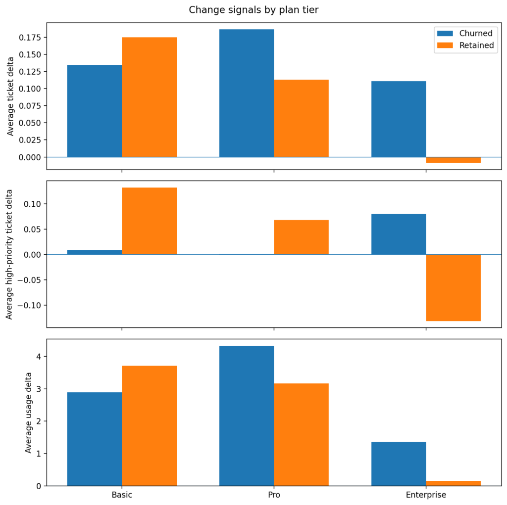
Figure 1 is the first place where the tiers reveal meaningful differences. Churned Enterprise customers are seeing higher ticket volumes, an uptick in high‑priority tickets, and usage that is still increasing. Retained Enterprise accounts do not show the same support pattern.
This suggests an important churn archetype in the dataset. Some customers are not churning because they quietly stopped using the product. Rather, they remain active as their support burden is increasing before churn. This is a different story from simple disengagement churn.
Signals for the Basic tier plan are weaker. Retained Basic accounts actually show larger positive deltas than churned accounts on several measures which suggests Basic churn may be driven more by commercial or low-commitment factors than by a clear support or usage deterioration pattern.
For Pro, the picture is mixed. Ticket and usage deltas are somewhat larger for churned accounts, but the pattern is not as clean as Enterprise.
This led me to look at the reason codes by tier.
Figure 2: Recorded churn reasons by plan tier
The distribution of reason codes differs by tier, but the unknown bucket remains large for all three. These labels are useful as supporting evidence rather than a definitive explanation.
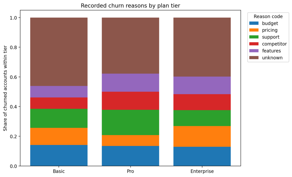
The first thing to notice in Figure 2 is that unknown is large across all tiers. Therefore, I treat reason codes as suggestive signals rather than conclusive proof. However, even with this limitation, the tiers are not behaving the same way.
From 18_reasong_code_by_tier.sql:
SELECT
    c.plan_tier,
    c.reason_code,
    c.churned_accounts,
    t.tier_churned_accounts,
    c.churned_accounts::numeric / NULLIF(t.tier_churned_accounts, 0) AS share_within_tier
FROM counts c
JOIN tier_totals t
ON t.plan_tier = c.plan_tierBasic leans more toward budget, pricing, and support, which fits the idea that Basic churn is more commercially sensitive and less tied to one obvious product behavior pattern.
Pro has the clearest named support signal in the reason codes. Aside from unknown, support is the largest reason in Pro, with budget, competitor, and features also contributing.
Enterprise is the most mixed. Pricing, budget, features, competitor, and support all appear at similar levels. No single reason dominates.
This is important because it lines up with earlier tier analysis that Enterprise churn does not look like one simple cause. Support burden rises before churn, but the recorded reasons are distributed across multiple explanations.
Figure 3: Enterprise accounts show the clearest pre-churn support signal
Churned Enterprise accounts show rising ticket volume and higher-priority ticket load in the final three months before churn. Usage remains positive, which indicates an active-but-frustrated churn pattern rather than simple disengagement.
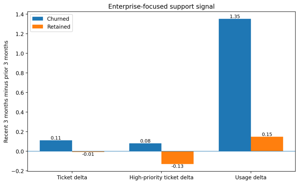
Figure 3 isolates the clearest result in the whole analysis. In the Enterprise tier, churned accounts show increases in total tickets and high‑priority tickets while still maintaining positive usage. Retained Enterprise accounts move in the opposite direction on the support metrics. This is the strongest evidence in the post, and it sharpens the interpretation from Figure 1.
What I’d tell the stakeholder
I would explain that the churn story is not the same across tiers. Enterprise accounts show the clearest pre-churn warning signal, and it looks more like rising support burden than silent disengagement. Basic looks more commercially sensitive, and Pro sits somewhere in between with support as the strongest recorded reason.
So, if the question is “what drives churn,” the answer is:
- There is not one universal driver.
- The support signal is the strongest in Enterprise.
- The recorded churn reasons suggest different churn archetypes by tier.
- The unknown bucket is large enough that the reason codes should support the story, not define it by themselves.
What I’d watch for next
If I were continuing the analysis, I would focus on three things:
- Enterprise support burden before churn
Are there specific ticket types, response delays, or unresolved issues that separate churned Enterprise accounts from retained ones? - Basic commercial churn
Are budget and pricing reasons concentrated in smaller seat counts, lower MRR, or shorter customer lifetimes? - Pro segmentation
Is the churn in Pro actually coming from two distinct populations: one motivated by support issues and the other by commercial factors?
The takeaway
The blended churn story was weaker than expected. The tier-level story was more useful. This is the main lesson from the post. Support and usage signals become more informative once the customers base is segmented, and recorded reason codes are most useful as a second layer of explanation rather than a first source of truth.
This is why I did not summarize churn drivers with one overall number or reason table. The better question is: which churn story are we looking at, and for which tier?
Full walkthrough on GitHub
The full repo includes:
- SQL pipeline (account-month snapshot from part one, support and usage metrics, pre-churn cohorts, change signals, tier summaries, and reason code summaries)
- Extract query for Python visuals (
19_extracts_for_python.sql) - Notebook that generates the figures (
02_visuals.ipynb)
You can find it here: sql-churn-analysis